
LEARNING EXPERIENCE DESIGNER
I design how
people understand
complex things.
Working at the seam of instructional design and visual & information design. So the way something looks is shaped by how people actually learn.
Visual & Information Design · Harvard-trained in learning & HCI
David Balan
Learning & Visual Design
Work
Craft
About
Contact
01 selected work
Two Projects, told in full — not a gallery of thumbnails
Each one follows the same path: the learning problem, the insight about how people take in that kind of information, the design decision it led to, and what changed. The visual craft lives inside the story as evidence.
Why only two
These are the pieces where the learning voice and the visual voice work at once. Depth proves the seam in a way a wall of images can't.
01 CASE STUDY
Google Fiber — customer-service learning experience
Learning Experience & Visual Design (led) · Built in Articulate Rise + Adobe CC with SME partners · Contract via Nelson Connects
Scalable e-learning that turned dense billing, account, and device-return policy into clear, scenario-based training for support teams across multiple regions.

DESIGN AS PERFORMANCE SUPPORT
Every visua vcl choice answered one question: can an agent find and trust this answer while a customer waits?
Clarity here isn't aesthetic. It's what holds up in the middle of a live call.
02 CASE STUDY
Micromind — an inclusive learning concept
Visual & UI Design (owned) · Learning scenario flow (contributed) · Team of 4 · Graduate coursework, Harvard Graduate School of Education
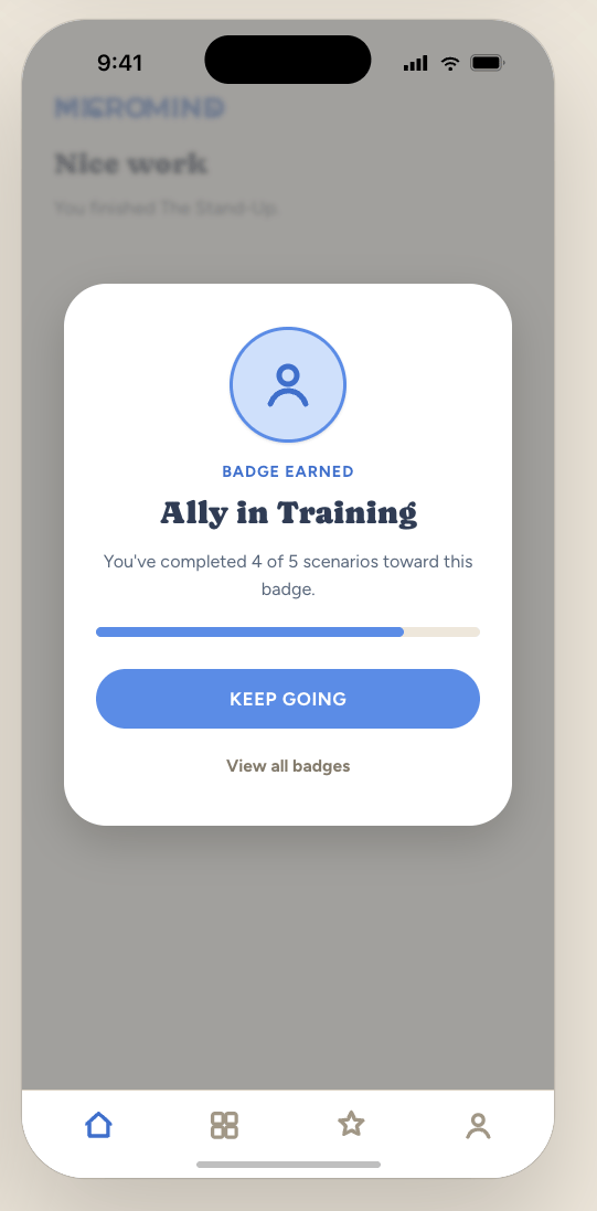
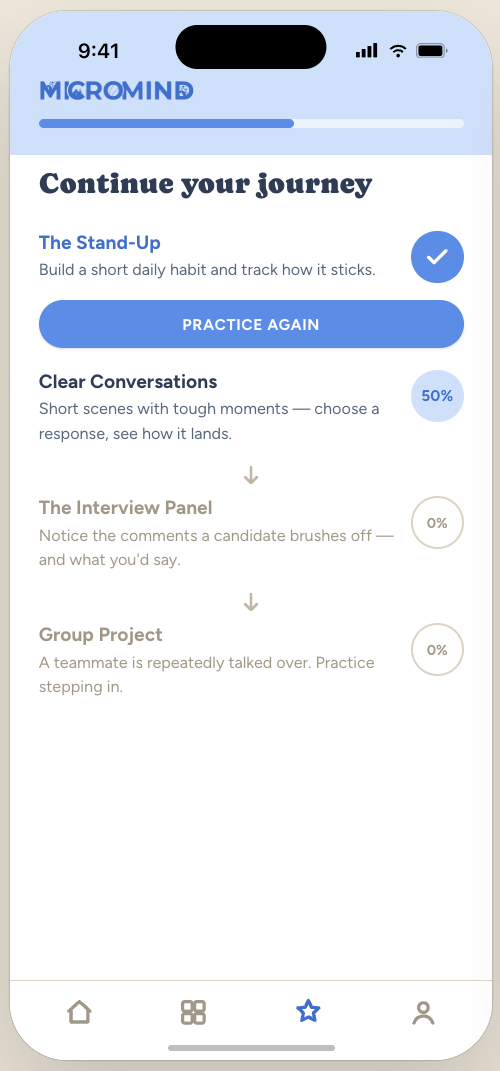
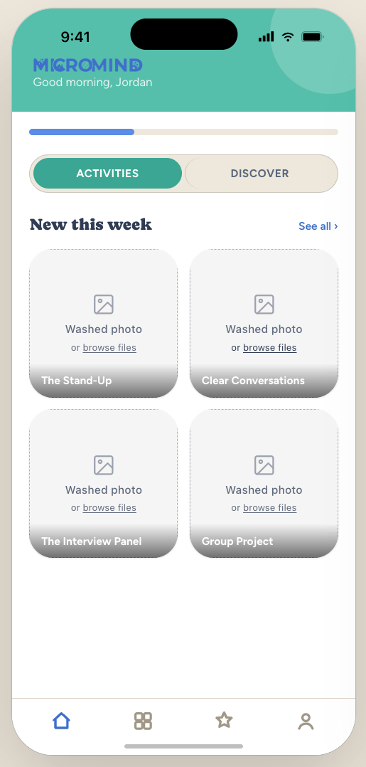
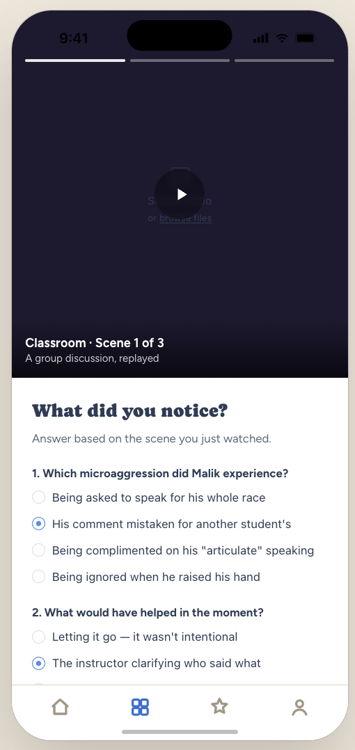
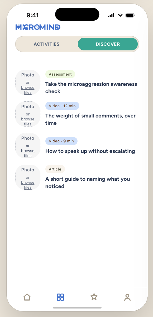
A concept for a scenario-based learning experience that helps people recognize and respond to microaggressions through low-pressure, narrative-driven practice. Built as a graduate team project at Harvard.
PROBLEM
Microaggressions are subtle, normalized, and hard to name. Conventional training can feel abstract or judgmental, which makes people defensive instead of reflective.
INSIGHT
Testing early prototypes with classmates, I saw people stay open when a scenario felt like a story to move through, not a test to fail. Emotional safety kept them engaged.
DECISION
I led the design and built the modules — structured flows, visual explanations, and real-world scenarios — working with SMEs to keep content accurate as tools and policies changed.
OUTCOME
Modular components scaled across regions, and the redesigned "Best Practices & Tips" series became a standard reference for other instructional designers.
FLOW MAP

DESIGN TOKENS
TYPOGRAPHY USAGE
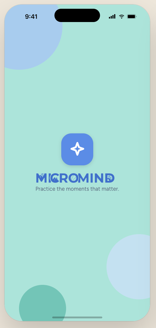
Practice the moments that matter
Continue your journey
Short scenes with tough moments — choose a response.
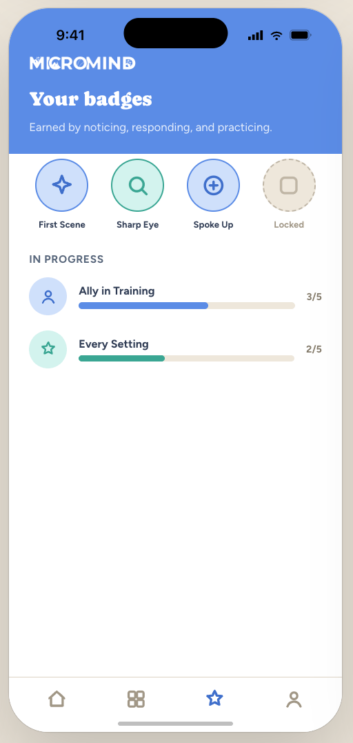
BADGE EARNED

The seam, live
Warmth wasn't a style choice. Rounded, friendly components lower defensiveness, so learners stay open while handling uncomfortable material.
A visual decision, made for a learning reason. That's the whole thesis in one project.